BounceMaps
RoadBounce Navigation App

Overview
RoadBounce Navigation App is a travel and route planning mobile app that goes beyond “fastest way from A to B.”
It lets users create and share personalized trip journeys — with AI assistance, manual refinement, and social sharing — designed for weekend travelers, groups, and creators.
Project Details
A smart, AI-enhanced travel companion for curated, shareable journeys.
I led this project from initial concept to branding, UX strategy, MVP, and iterative releases that expanded features based on user feedback and testing.
Role
UX Designer
(Concept, UX, UI, Prototyping, Testing, Handoff)
Timeline
Duration: 12 months + ongoing iteration
Team
Manager, Senior Engineer, 2 Developers
End-to-end product design | Conception → Branding → MVP → Multiple Feature Releases
The Challenge
Most navigation apps focus on efficiency — “quickest route from A to B” — but real travelers want experiences: curated spots, personalized detours, memories, and social sharing.
There was no product that balanced:
Ease of creation
not tedious manual pinning
Personalization
meaningful stops with context
Storytelling & sharing
journeys you can save and share
Scalability
solo planners to shared group trips
The core challenge was designing a navigation experience that is both simple to begin with and rich in exploration, without overwhelming users. An application that aligns with the brand motto - YOUR PARTNER IN ROAD SAFETY
Project Goals
User Goals
Quickly generate a personalized trip plan
Modify and curate journey stops
Save, share, and trust experiences
Reduce effort and cognitive load during creation
Business Goals
Position RoadBounce as more than a routing tool — a smart travel assistant
Increase app engagement and retention
Differentiate from existing map/navigation solutions
Success Metrics
Higher engagement in trip creation flows
Preference for AI-assisted creation over manual only
Increased sharing and saved journeys
Visual Design
Colour Palette

Iconography
This project marked the beginning of my UX journey, and the most valuable outcome wasn’t the final UI, but the shift in how I think about product design. Some of the key learnings include:
Design Process
Although the app evolved across multiple phases, the design process followed an iterative, insight-driven loop. Instead of moving linearly from research → wireframes → UI → launch, each release was shaped by feedback, behaviour patterns, constraints, and opportunities.
User Study
Experience
The Flow
Wireframing
Visual Design
Usability Testing
Execution
The product evolved across three major phases: validating the idea, turning collections into journeys, and transforming journeys into living experiences.
Phase 1: Making The App Exist
Phase 2: Turning Maps Into Journeys
Phase 3: A Smart, Personalized Travel Companion
Phase 1
Create a simple way to collect places and share maps
We started with the most fundamental human behavior we wanted to support:
I visited places that matter to me.
I want to share this route with someone else.
The first version of the product enabled:
Dropping pins on a map
Naming places
Saving them as a collection
Sharing the link with friends

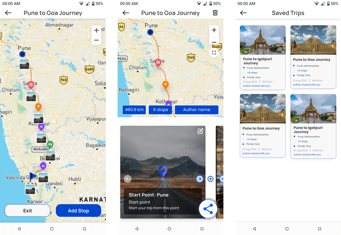

Phase 2
Turning Maps Into Journeys
Add navigation + distances + real utility
Once collections existed, the natural next step was movement. We added:
Route connections between pins
Distance and time calculations
Navigation support through Google Maps
Better map interactions
This turned the app into a true travel tool instead of a visual scrapbook.
Internal critique + early testing
At this point, we held multiple product reviews and usability walkthroughs — inside the team and with people outside the organization. We wanted blunt feedback, not polite validation.
What surfaced was honest and extremely useful:
The flow felt longer than it needed to be
Too much manual effort in pin creation
The UI hierarchy wasn’t helping users understand where to begin
Navigation needed stronger visual clarity
Some tasks took more taps than necessary


Improvement Loop
To refine the product, we followed this cycle:
Observe users → Capture friction points → Rework layouts, flows, and interactions →
Test again → Approve or iterate
This loop ran continuously — reducing clutter, removing copy-heavy sections, improving button language, strengthening visual grouping, and simplifying steps.
This insight shaped the biggest evolution of the product.
ser feedback revealed that people often had their key locations stored in Google Maps. Instead of asking them to re-enter the same information, we designed a way to import those places directly into the app.

Phase 3
A Smart, Personalized Travel Companion
Transform travel from manual planning to guided exploration
By now the foundation was solid. People could:
pin places
create collections
see distances
navigate routes
But the experience still demanded effort.
And effort reduces adoption.
Direction Change
We asked one question:
“What if the app did the planning?”
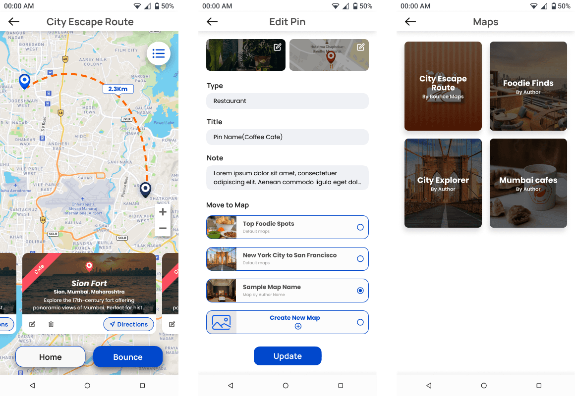
AI Trip Creation
We introduced a new core flow:
User describes a trip → App generates curated map collections.
“Weekend waterfalls near Pune”
“Goa trip with beaches + cafes”
The system responded with places, categories, and routes — instantly.
Balance: Automation + Control
Users could:
edit pins
reorder stops
delete suggestions
replace items
save, share, and revisit journeys


Learnings
This project marked the beginning of my UX journey, and the most valuable outcome wasn’t the final UI, but the shift in how I think about product design. Some of the key learnings include:
Small features can create major behaviour shifts
Even simple additions such as saving routes or importing locations dramatically changed how people used the app.
Users wants their work done more than features
Testing revealed that users don’t care about “saving pins” or “creating routes” as actions. What they care about is reaching places faster, sharing trips easily, and avoiding effort.
Clear information hierarchy is important
Reorganizing layout, spacing, and copy helped people understand the flowimmediately.
Internal feedback can be as valuable as external research
As internal reviews conssted of people from all the departments, we got to test the product with diverse group and that impacted design decisions hugely.
Design is never linear
Features like Google Maps import, route creation, and sharing workflows evolved through cycles of critique, redesign, and validation. It shows that design is always a process of testing and reworking on insights.
Next Steps
These next-phase opportunities are directly based on user feedback and platform direction:
Future phases will focus on observing how people use the app in real travel scenarios and gathering feedback to inform design improvements based on real-world behaviour.
As features evolve, the UI and interaction patterns will continue to be refined for clarity, accessibility, and ease of use.
Design components and visual styles will be expanded and standardised
Read more of my case studies

Little Loops

Suspension Testing App
