Ekohome
A conceptual smart home automation app

Overview
Design Intent
Wireframes
Visual Direction
Design
Overview
Ekohome is a conceptual smart home automation app (iOS) designed to help users manage and control all smart devices in their home — from lights and sensors to thermostats and security — in one place.
Users should be able to view device states, turn devices on/off, and interact with their smart environment easily.
Project Details
This project was completed as a group project (7–8 members) and was my first UX case study.
While the project included real user research and interviews, the overall UX foundation remained weak due to my early-stage understanding of UX, system constraints, and translation of insights into design decisions.
Role
UX Designer (End-to-end)
Timeline
Duration: 12 weeks
Team
7–8 design students
Project Goals
Create an app that simplifies smart device control
Organize devices by rooms and categories
Make control actions visible and intuitive
Explore an engaging visual design system
Problem Statement
Smart home systems are complex by nature. Users struggle with:
Understanding device states
Managing multiple devices across rooms
Navigating technical controls without context
Research & Insights
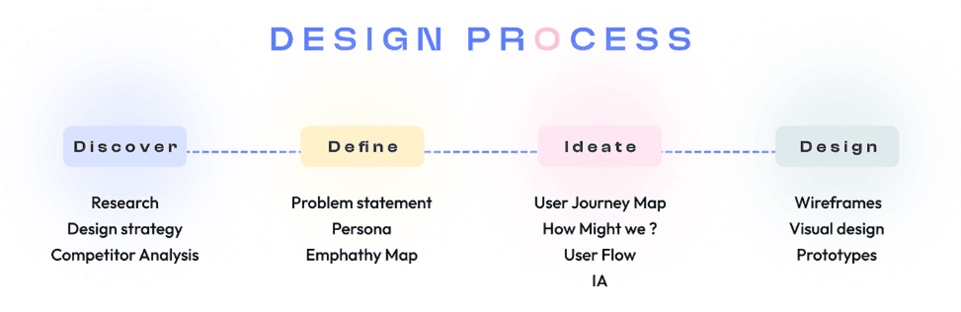
Before finalizing the homepage layout, I explored five low-fidelity wireframe variations to test different ways of introducing the brand, structuring content, and guiding user attention.
Each wireframe focused on solving a specific question rather than designing everything at once.
User Interviews
How users find and control devices
Which device functions matter most
Pain points when devices behave unpredictably

Competitive Analysis
We compared existing smart home apps to see:
Navigation patterns
Device grouping strategies
Visual feedback for controls
This helped us identify where other apps succeeded and failed in clarity and discoverability.

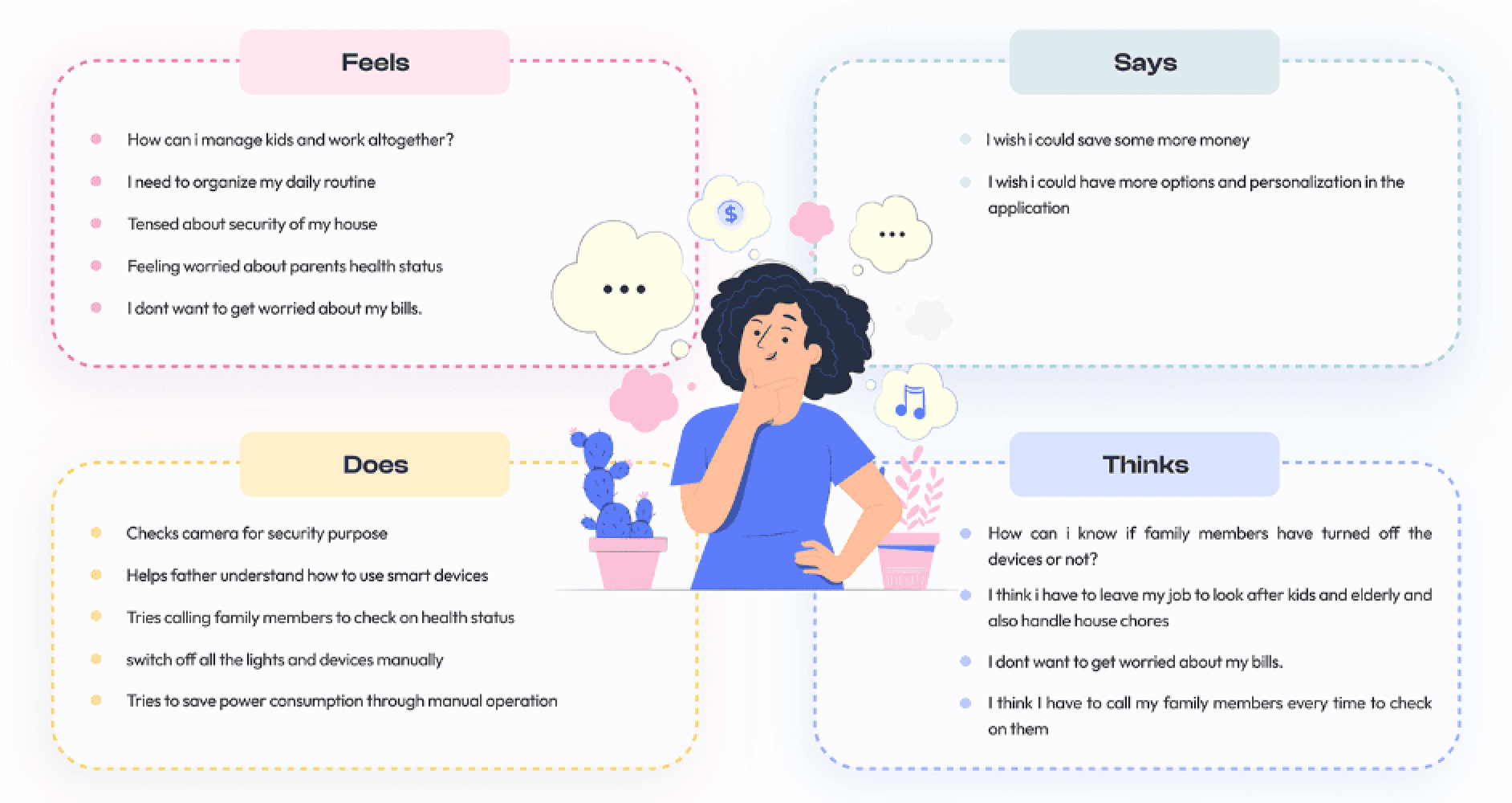
Empathy Mapping
As part of the research phase, our team created an Empathy Map to capture what users:
Say (their spoken needs and frustrations during interviews)
Think (internal expectations and hesitations about smart devices)
Do (their day-to-day control patterns and habits)
Feel (emotions related to reliability, safety, and ease of use)
How Might We
After synthesizing interview insights and empathy mapping, the team reframed findings into How Might We questions to open design thinking instead of narrowing it too early.
Some of the core HMW prompts included:

User Flows
We grouped devices by:
Rooms — living room, bedroom, kitchen
Categories — lights, climate, security
and then we sketched flows for:
Turning devices on/off
Navigating between rooms
Viewing device status

Information Architecture

Wireframes

Visual Design
Colour Palette

Typography

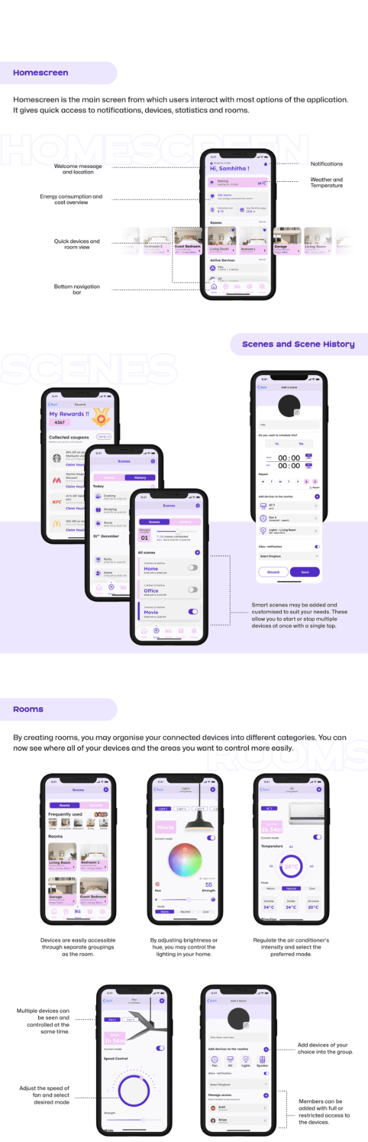
UI Designs

Learnings
This project marked the beginning of my UX journey, and the most valuable outcome wasn’t the final UI, but the shift in how I think about product design. Some of the key learnings include:
Research only works when translated into design
We conducted real interviews, gathered meaningful insights, and built empathy maps — but we were not able to convert those into structured UX decisions.
Visual inspiration should support UX, not replace it
Many interface elements were influenced by reference apps. This sped up UI creation, but also led to decisions that weren’t fully rooted in user needs, or in how smart home systems behave.
A well-designed UI doesn’t guarantee a strong user experience
The UI for Ekohome looked modern and cohesive, but beneath it, some flows lacked logic, clarity, or technical feasibility. This taught me to focus first on structure, navigation, and interaction.
UX choices need validation
Because we did not do usability testing, we could not confirm whether users understood the flows, found them intuitive, or completed tasks efficiently.
Understanding the system matters as much as understanding the user
Without grasping how the system works, we designed interactions that may not be realistic.
Next Steps
If I were to improve or redesign Ekohome today, my approach would be shaped by the lessons learned:
Align features with real use cases
Conduct usability sessions
Optimize navigation based on behavior, not visuals
Justify visual choices
It wasn’t a perfect UX project, but it was a perfect teaching project. It helped me understand what UX truly demands: structure, intent, validation, and empathy. Everything I design today is stronger because this project showed me where the gaps were.
Read more of my case studies

Little Loops

Brewed Bliss
