Little Loops
Children’s Clothing Resale Platform
Overview
Little Loops is a conceptual circular kidswear brand focused on extending the life of children’s clothing through resale, reuse, and mindful consumption.
The brand aims to make second-hand clothing feel trustworthy, joyful, and intentional rather than temporary or lesser.
The Problem
From a brand perspective, there was a gap for:
A warm but credible identity
A system that feels circular, not disposable
Visuals that appeal to both parents and children without leaning childish
Parents often hesitate to buy or resell pre-loved children’s clothing due to concerns around hygiene, quality, and trust.
Role
UX Designer (End-to-end)
Brand Designer
Timeline
Duration: 6 weeks
Scope: Branding + Website design
Process
Research & Insights
Defining the Experience
Wireframing
UI Design
Goals
Build trust around resale and circular fashion
Make sustainability feel approachable, not preachy
Create a brand that feels gentle, modern, and long-lasting
Balance playfulness with responsibility
Target Audience
Primary:
Parents of young children who value sustainability but still prioritize quality, safety, and ease.
Secondary:
Eco-conscious families exploring resale or upcycled clothing for the first time.
Naming & Concept
Little Loops reflects the idea of circularity and continuity.
Clothes move through “loops” of use, care, and reuse instead of a linear buy–use–discard cycle.
The name feels:
Soft and child-friendly
Memorable and flexible
Closely tied to the idea of circular fashion

Design Intent
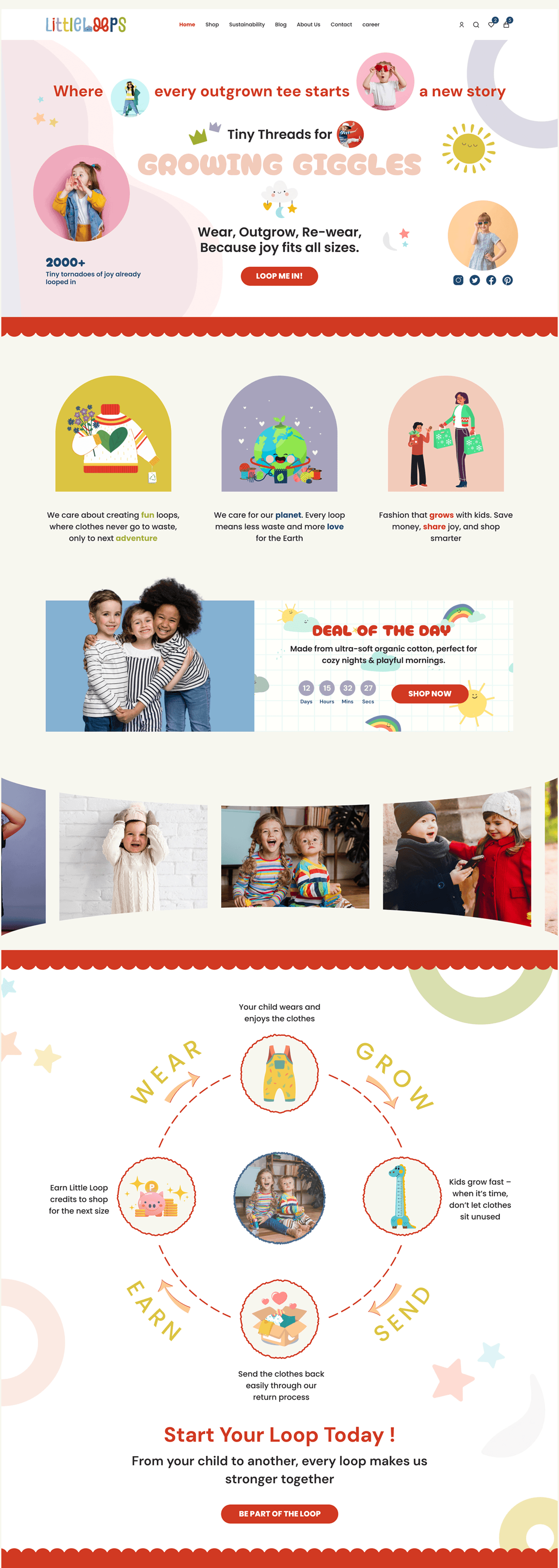
The design prioritizes clarity, emotional comfort, and visual calm. The homepage needed to act as:
A brand introduction
A confidence builder for first-time visitors
A gentle guide into circular fashion
Homepage Structure
Hero Section
Introduces the brand purpose in one glance
Clear value-driven headline
Soft visuals that feel child-safe, not childish
CTA focused on discovery, not urgency
Brand Values Section
Explains who Little Loops is without long explanations
Illustrations for core values
Simple language instead of marketing jargon
Featured Highlight
Spotlights a product or concept to ground the idea
Helps users understand what is being sold
Reinforces quality and trust
The Loop Process
A visual explanation of the resale cycle
Wear → Outgrow → Send Back → Loop
Designed to feel easy and positive
Wireframe Exploration
Before finalizing the homepage layout, I explored five low-fidelity wireframe variations to test different ways of introducing the brand, structuring content, and guiding user attention.
Each wireframe focused on solving a specific question rather than designing everything at once.
LO-FI Wireframes

Why This Approach
Designing multiple wireframes allowed me to:
Compare user focus and scroll behavior
Build a homepage that feels intentional rather than assumed
This step ensured the final layout was not just visually appealing, but user-driven.
Visual Direction
The visual language balances playfulness and restraint. The result is a homepage that feels calm, thoughtful, and parent-first.

Illustrations & Graphic Elements
Subtle graphic elements and illustrations add warmth without overwhelming the interface. These elements support storytelling while keeping the focus on the product and message.


Read more of my case studies

Ekohome – UX Case Study

Art Gallery App
