RoadBounce Website Redesign
Redesigning Roadbounce’s digital presence to drive clarity, trust, and growth.

Overview
Roadbounce is a tech company that delivers real-time road insights for government and enterprise clients
I led the redesign of its website, creating a functional, brand-aligned platform that improved navigation, clarified offerings, and optimized SEO to better support business growth.
Impact
Role
Website Redesign, Wireframing, Prototyping, Stakeholder Communication, WordPress Page Development
Timeline
Duration: 6 weeks
Scope: End-to-end website redesign (from structure to visuals)
Process
Research & Discovery
Information Architecture
Wireframing
UI Design
Iteration & Feedback
Wordpress website development
Where do we start?
The project began with understanding Roadbounce’s position as a B2B mobility solutions company and its target audience of government and enterprise clients. I gathered inputs from stakeholders about business goals, reviewed feedback on the old site, and analyzed competitor websites to identify patterns in navigation, content structure, and visual tone that could resonate with this audience.
Research & Insights
To better understand the needs of Roadbounce’s B2B audience, we gathered feedback from internal stakeholders, clients, and industry partners. This helped us validate assumptions, uncover usability issues, and refine the website structure.
Target Audience
Government agencies & transport authorities
B2B clients in automotive and infrastructure
Decision-makers looking for reliable mobility solutions
Pain Points
Text-heavy, unclear navigation
Low visibility of product offerings
No clear call-to-action for partnerships or inquiries
Outdated visuals not aligned with new branding
Business Goals
Attract more project leads & partnerships
Improve brand credibility and trust
Make navigation straightforward for non-tech users
Success Metrics
Increase in inbound leads and business inquiries
Improved user navigation (fewer drop-offs)
Positive feedback from stakeholders and clients
SEO-driven traffic growth
Competitive Analysis
To ensure Roadbounce’s new website met industry expectations and stood out, we analyzed how direct competitors structured their content, presented products, and positioned themselves.
Key Observations
Clear Product Positioning: Competitor websites gave prominent visibility to their flagship products on the homepage.
Simple Navigation: Menus were streamlined with 3–5 primary categories, reducing friction for users.
Visual Emphasis: Most leaned on product imagery, data visualizations, and explainer graphics to highlight value.
Trust Signals: Case studies, client logos, and testimonials were common credibility markers.
Call-to-Action Placement: Strategically repeated CTAs (e.g., “Get a Demo,” “Contact Us”) ensured conversion opportunities were always visible.
Competitive
Analysis

Ideation & Design
We began with rough sketches and finalized the branding—colors, fonts, and visual style—to set a consistent tone. Then, we iteratively developed wireframes and mockups, combining preferred layouts for each section to create the final homepage and all other webpages.
Visual Identity
Rough Sketches
Wireframing
Basic Mockups
Final Layout
Initial Sketches & Brainstorming
In the early stage, we explored ideas through quick sketches and brainstorming sessions. These rough drawings helped us map out potential layouts, prioritize features, and capture raw ideas without focusing on details.
The sketches and notes acted as a visual playground—allowing us to experiment, compare, and refine concepts.


Darker
Grotesque
Aa





What Didn’t Work (and Why)
Before arriving at the final direction, we explored multiple design variations. These rejected designs were an important part of the process, helping us identify what didn’t work and refine our approach. By analyzing these missteps, we were able to make stronger design decisions and move toward layouts that balanced usability, branding, and functionality.


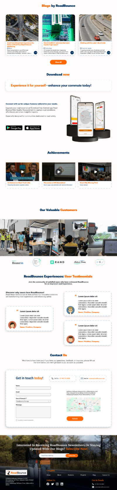


Content Redesigns
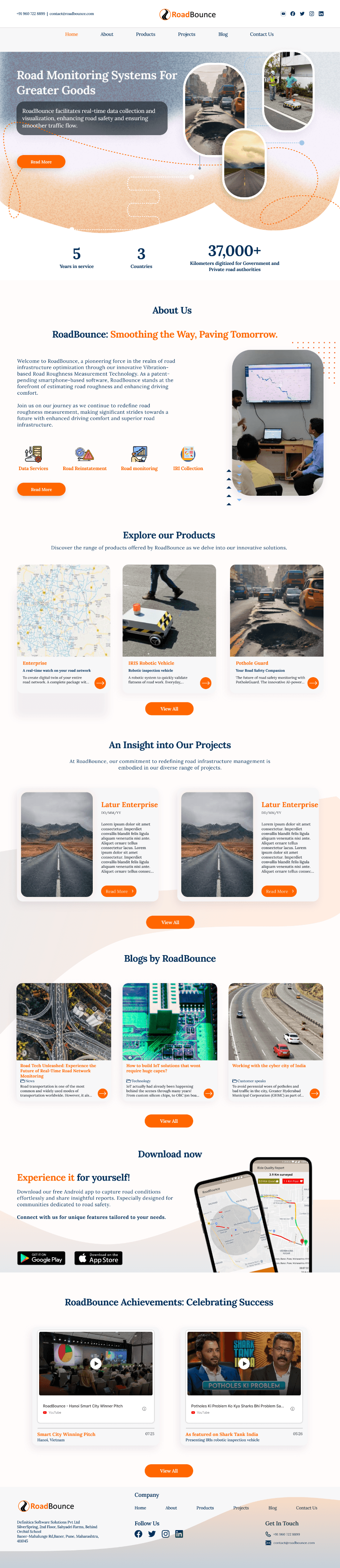
The primary goal of the redesign was to clearly communicate the platform’s value and guide visitors toward taking action. The earlier layouts lacked visual hierarchy, used inconsistent fonts and imagery, and often left users confused about what the product offered.
In this phase, I focused on creating a cleaner structure, simplifying the content, and building layouts that made the offering easy to understand at a glance. By improving font hierarchy, aligning visuals with messaging, and streamlining sections, the redesigned pages feel more intuitive and engaging.
As the website is meant to capture interest and build trust, every element was reworked to highlight clarity, credibility, and a strong call-to-action.


What I Learned
Designing for clarity over complexity is critical when working with technical, AI-driven products.
Strong content hierarchy and storytelling can make complex systems easier to trust and understand, especially for non-technical stakeholders.
Small design decisions (text reduction, section ordering, layout changes) can significantly improve user confidence.
Close collaboration with developers and stakeholders helped align design choices with real business goals, not assumptions.
Iteration and feedback were key in refining the website into something purposeful and focused.
What's Next ?
Expand case study pages with measurable outcomes (road length surveyed, accuracy improvements, decision impact) to strengthen enterprise trust.
Add interactive data visual sections on product pages to demonstrate how road data flows from collection to insights, replacing static explanations.
Read more of my case studies

RoadBounce Nav App

Art Gallery App
