Suspension App (NDA)
UX Enhancement & Interaction Design
Testing flow · Device placement · Test feedback · Wheel results · Vehicle report
The product already had the diagnostic system. My job was to make the testing process easier for people to perform correctly and make the results easier to understand.
Product Description
Suspension Tester is used to check the condition of a vehicle's suspension and wheels.
The basic flow was already in place:
Select vehicle → Select wheel → Place phone → Run test → Review result → Test next wheel → Generate report

Then what was the problem?
The user had to physically place and hold the phone on the vehicle in a particular way. If the phone wasn't positioned correctly, or if the user checked the result before the test had finished, the reading could be unusual or the test might not record properly.
The final report contained useful information, but it wasn't particularly easy to scan.
The main issue as seen by users:
How do I know the phone is straight?
Is the test recording yet?
Can I check the result now?
Where do I look first in the report?
Understanding the problem
The problem wasn't only on the screen. The user wasn't just tapping through an app. They were:
Holding a phone → Placing it on a car → Following physical instructions → Testing → Waiting → Reading a graph
01 / Phone placement
The phone had to be placed correctly on the vehicle.
But the existing screen mainly showed the user where to put it. It didn't give them a clear way to know whether it was actually straight.
02 / Test timing
Users could start checking the result before the test had completely finished. Which would lead to unusual readings.
03 / Physical instructions
The user had to remember things like:
where to place the phone
how to keep it stable
when to start
when not to move it
when to wait for the test to finish
04 / Results
Once the test was complete, the app had another problem.
There was a lot of useful information, but the important result wasn't always the easiest thing to find.
The first version showed people where to put the phone. It didn't really tell them if they had done it right.
Visual Indication and breakdown of basic instructions to follow
The user had a picture to follow.
But there was still a basic question:
"How do I know I've actually placed it straight?"


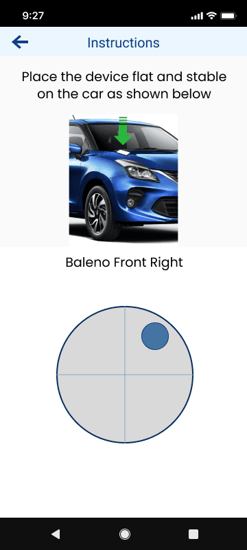
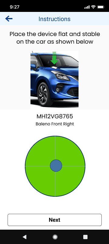
We added a simple alignment check.
We added a bubble/circle indicator that responded to the phone's position.
When the phone wasn't aligned, the indicator showed that it needed adjustment. When it was aligned, the user could see that they were ready to continue.
Instead of asking users to judge the phone's position themselves, we gave them something on screen they could adjust against.
People were checking the result too early.
During testing, users could be unsure whether the recording had finished. If they checked or moved on too early, the result could be unusual.
So the testing screen was redesigned to make the current state much more obvious.
From "follow these instructions" to "the app tells me what to do now."
The flow itself didn't change dramatically. The important change was adding feedback at the points where users could make a mistake.

01 / Select
Select the wheel
to test
02 / Position
Watch demo → Place
phone → Align

03 / Test
Countdown → Don't move
→ Push → Record

04 / Review
Result → observe
→ Next wheel
Once the test was done, the next question was: "What did we actually find?"

Before
Label and dropdown to
select observed symptoms

First Iteration
Users found too much information,
so had to minimize

Final Design
The main condition is
visible immediately.
The report had the information. The issue was it needed to be easily understandable - it needed better hierarchy.

Existing Screen
Complete vehicle report
was missing

First Iteration
The layout replicated physical reports hence were easy to read, but the table needed to go
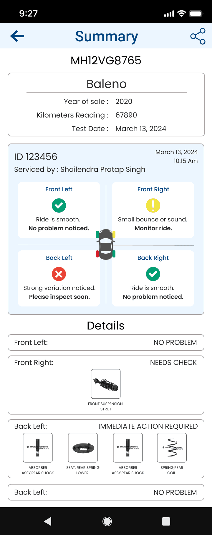
Final Design
The approved design that helps users understand vehicle diagnostics easily
The report had the information. The issue was it needed to be easily understandable - it needed better hierarchy.
What I took away from this project
This project made me think beyond the screen.
The app could have the right instructions and still fail if the physical action wasn't clear enough.
In this case, a small alignment indicator was more useful than adding more written instructions.
I also learned that for technical products, showing users more data isn't always the answer. Sometimes they just need to know what is happening right now and what they need to do next.
Read more of my case studies

Brewed Bliss

Little Loops
